
Websites have relied on the same fonts for many years to display messaging and symbols to visitors. However, fonts have become much more dynamic in the past five years.
There are many fonts that you may want to use on a website, but they might not display correctly on every browser.
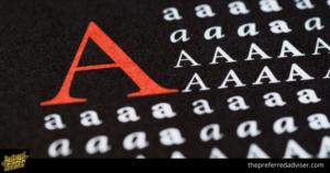
Web safe fonts are becoming the new standard in web design as they work well across all browsers and devices.
If a user didn’t have a particular font stored on their computer, they would see a different font instead, such as Times New Roman or Verdana.
To prevent this issue, web developers created a way to ensure the right font displays regardless of the fonts installed on the user’s computer.
There are only a handful of fonts that can be universally displayed on any web browser. These are known as “web-safe fonts” or “CSS fonts”.
Although designers can utilize current web CSS fonts that are fairly widespread across current browsers and email applications, there are still some inconsistencies.
1. Helvetica (sans-serif)
One of the world’s most popular and versatile fonts is Helvetica. Its simplicity as a sans-serif font makes it easy to use in a variety of scenarios and designs.
2. Arial (Sans-Serif)
The Arial font is the most popular sans-serif font used on the internet. It was created for printers who wanted to use the popular Helvetica font without having to pay licensing fees. Arial has a similar appearance and feel to Helvetica.
Arial and fonts in the Arial family are often seen as the best fonts to use on websites because they can be used on any operating system.
3. Arial Black (Sans-Serif)
 If you’re looking for a bolder font in the Arial family, Arial Black is a great option. It’s perfect for headers, decorative text, and emphasized text.
Use of the color should be strategic and careful.
4. Verdana (Sans-Serif)
Verdana is a typeface that is popular for its clear and large letters both online and offline. Although it is similar to Arial and Helvetica, it has a simpler structure.
The text’s characters have elongated lines which may not work well with some designs. However, it is a good option compared to Arial.
5. Tahoma (Sans-Serif)
Tahoma is a similar font to Verdana except it is bolder and the characters are closer together. It is often used as an alternative to Arial.
6. Trebuchet MS (Sans-Serif)
 Another web-safe sans-serif font is Trebuchet MS, designed by the Microsoft Corporation in 1996. Many websites commonly use it for their body copy, making it a solid alternative to the sans-serif font your site uses.
It also may not look as “basic” as Arial.
7. Impact (Sans-Serif)
The font Impact is good for grabbing attention and making a statement. It is also narrower than most fonts, with characters that are taller than they are wide.
Digital devices were first introduced to the impact in Microsoft Windows in 1998. Since then, it has seen a resurgence in popularity in internet memes, superimposed on images for a humorous effect.
8. Gill Sans (Sans-Serif)
In 1928, Monotype released Gill Sans, which blends classic and modern influences to create a simple and clean typeface for both print and digital use.
9. Times New Roman (Serif)
Times New Roman is the go-to serif font. It’s extremely popular and the primary font for Windows devices and applications, like Microsoft Word. Browsers often revert to it when they can’t display the specified serif font.
Originally, the Times New Roman font was created as an updated version of thefont used in the Times newspaper. Because of this, Times New Roman is one of the most recognizable fonts in the world.
10. Georgia (Serif)
Georgia is a serif font that was designed specifically to be more readable at various font sizes. The letters are heavier weight than most other serif fonts, making it an excellent choice for mobile-responsive design.
11. Palatino (Serif)
Hermann Zapf designed the old-style Palatino font in 1949. It was used initially in book publishing and is now popular in all online applications. This is at least partially because its wide structure and openness make it easy to read at a distance.
12. Baskerville (Serif)
Baskerville is a font that has been around since the 1940s. It is a font that is between classic and modern styles. Originally, it was a font that was used for quality book-making. However, it has gone through several updates for digital use.
13. Andalé Mono (Monospace)
All monospaced fonts have evenly-spaced letters which gives the text a mechanical quality.
This font is perfect for a software development environment because it was developed by Apple and IBM.
14. Courier (Monospace)
Courier is a type of font that makes all the letters and characters the same width, and closely resembles typewriter text. Many email providers use it as their default font because it is easy to read. Courier is also widely used in coding applications because it is easy to read.
The standard font Courier is similar to Courier New, so listing Courier New in your font stack after Courier offers the browser two different, but similar, options.
15. Lucida Console (Monospace)
Lucida Console was designed to be a highly legible monospaced typeface that looks less mechanical than other monospace fonts. It is similar to human handwriting, making it a good choice for those who want a font that is easy to read.
16. Monaco (Monospace)
 Monaco is a monospace sans-serif font that is native to macOS. Apple users will be more familiar with it because it is exclusive to the operating system.
17. Bradley Hand (Cursive)
This typeface is based on the handwriting of designer Richard Bradley. It has a casual, personal quality that makes it ideal for headings, decorative text, or short bodies of text.
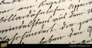
18. Brush Script MT (Cursive)
Although Brush Script MT is designed to look like quick handwritten strokes, it is not very legible. It is best to use this font for decorative purposes only.
19. Luminari (Fantasy)
If you’re looking to add a bit of medieval flair to your headlines, Luminari is a great font to use. It’s decorative and Gothic in nature, making it perfect for adding an old-world feel to your web pages.
20. Comic Sans MS (Cursive)
The Comic Sans MS font was designed to looks like the lettering found in comic books. It’s informality and fun vibe has made it the target of many internet jokes.
Even though Comic Sans may not be the best-looking font, it is still useful because it is easier for people with dyslexia to read.
21. Apple Chancery ( Cursive )
Apple Chancery is a formal cursive font created by Apple Inc. It is an elegant typeface that gives off a sophisticated impression, making it a great choice for a classy website.
22. Impact ( Fantasy )
While Impact may work well as a font for headlines, it is not suitable to use in body text. It can look bad if used excessively.
23. Chalkduster ( Fantasy )
Chalkduster can also be used for creative projects outside the classroom. This font is called Chalkduster because it looks like chalk on a chalkboard. It would be a good addition to any educational webpage because it reminds us of grade school classrooms.
Chalkduster can also be used for creative projects outside the classroom.
It is most appropriate for short text and headings because of its bold and detailed style.
24. Jazz LET ( Fantasy )
Jazz LET is a typeface that gives the appearance of The Great Gatsby.This font is a great way to create the look of the roaring ’20s in a webpage.It is a bold and detailed font that is best suited for short text and headings.
25. Blippo ( Fantasy )
Blippo is a font that is very bold. Each character was styled using the shape of the rectangle and circle. It is very strong and sturdy, making Blippo a great font for quirky titles and headings.
26. Stencil Std( Fantasy )
Stencil Std is a typeface inspired by stencil lettering. It is best used for bold titles and headings.
27. Marker Felt( Fantasy )
The Marker Felt font is based on handwriting done with a felt-tip marker. The letters even include the small dot left at the end of each marker stroke. Marker Felt is a good choice for educational websites because it looks like writing done with a dry-erase marker.
28. Trattatello ( Fantasy )
Trattatello is a typeface inspired by Chinese calligraphy. It creates an elegant and mysterious feeling, making it a great choice for poetry or short passages.
Should You Use Web Safe Fonts?
 Most websites are using web-safe CSS fonts.
The purpose of using a fallback font is to ensure that Times New Roman will display on a user’s browser, even if they have an old machine or poor internet connection that prevents them from loading web fonts from Typekit.
Different operating systems can also cause issues. For example, visitors may not know what font you selected because most people don’t look at source code to understand why everything is suddenly in Times New Roman.
Both designers and website owners need to specify the types of fonts that will be displayed on their pages.
If you want to use a sans serif font like Lato, you should have a web-safe font such as Arial installed as well. This will ensure that the site looks somewhat similar to the design if the user is unable to load your web font.
Email and Web Fonts
Most modern web browsers can load web fonts, but email clients are different. Some users may not be able to load web fonts in their email client.
The method can be used to install a web font service in the email’s code. This method is different and performs slightly better in all email clients than the import method.
The least successful method you can try is the font-family method.
You always want to have a default font selected in case the user can’t view your web font.
How to Use Web Fonts
To get code for web fonts, you can go to Google or Typekit. On these sites, you can browse through a selection of fonts, which include serif, sans-serif, and handwriting fonts. For each font, there is a corresponding code that you can use in your web design.
Here are a few different font kits to choose from online:
Google fonts
Google provides a free service of downloading fonts to be used in design programs such as Adobe and Sketch. This is a very popular option among designers today.
Typekit by Adobe
If you’re a designer who uses Adobe products, you can subscribe to Adobe’s font service to access fonts for your web design projects. This is a great option for teams of designers and developers who work closely together.
Other web fonts
If you’re looking for more selection, you may also want to try some of these more costly services.
Correct Use of Web-Safe Fonts
This is the font that will be used should the web font fail to load for any reason While you can quickly install a Google Font, you might not know when to use web-safe fonts.
It’s crucial to include a default or web-safe font whenever you have a font-family that uses a web font. That way, the default font will be used if the web font can’t be loaded for any reason.
If you want to use the Montserrat font on your website, you can add the following code to your CSS: “font-family: Montserrat, Arial, Sans Serif.” The computer will try to use the Montserrat font first, but if that font is not available, it will default to Arial.
Remember to Test Your Fonts
Before making your website or email public, you should test how your fonts will look on different browsers and email clients.
Make sure you know how your web fonts will display to avoid your users seeing a completely different font style that will ruin your design.
Use Web-Safe CSS and HTML Fonts for Your Designs
 It’s important to choose the right font because it can affect how your message is perceived and can help or hurt your website campaigns.
It is important to keep learning and to be aware of how your fonts appear on different browsers and devices.
Before you publish your website, test your font stack on various browsers to ensure compatibility, and use fallback fonts when necessary.
You can make your brand voice stand out by choosing the right fonts.
0 comments